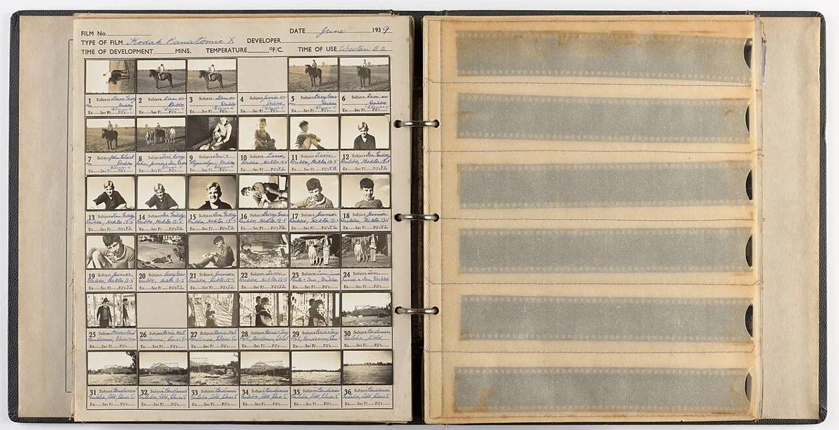
When a folder contains twenty nearly similar photographs, opening each full-size file is an awkward way to decide which three deserve attention. A contact sheet puts the collection in one view. Its value comes from comparison: changes in expression, framing or light become easier to notice when neighboring images remain visible.
A useful sheet also answers a less glamorous question: which original file is that? Without reliable labels, a promising thumbnail becomes another search task. Treat the sheet as a map of the collection, with a clear route back to each source, rather than as a decorative collage intended to stand alone.
Choose what the comparison is for
A first selection pass might look for composition. A second might compare a sequence of gestures. A client review might need to identify a preferred product angle. These purposes affect which images belong together. Mixing unrelated shoots into one crowded sheet makes the layout larger without making the decision easier.
Make a working selection before generating the sheet. Keep related frames in an understandable order, such as capture sequence or a manually chosen group of alternatives. If you change the order, preserve enough naming information to find the originals. Do not assume a recipient has the same folder sorting settings as you.
Adobe Bridge’s contact-sheet documentation shows how grid layout, page settings and filename captions contribute to an index. Handyfold offers a smaller browser-local version of that task: a labeled PNG sheet. It does not provide Bridge’s full output workspace or a photographic asset-management system.
Size the grid for the decision
More columns reduce the space available to each image at a given viewing width. A six-column sheet can be useful for a broad overview, while a smaller number of columns can make differences in expressions easier to see. There is no universally correct density. Open the result at the size in which someone will actually review it.
In Image contact sheet, the cell-width setting defines the square thumbnail area. Images fit inside it without stretching, so portrait and landscape photographs can leave different amounts of background. A separate label strip sits beneath each image. This keeps the photo’s proportions intact rather than cropping every frame into a matching square.
Try the generated sample with three columns, a cell width of 240 pixels and twelve-pixel spacing. Three cells contribute 720 pixels, while the four vertical gaps contribute another 48. The exported sheet is 768 pixels wide. The label strip and outer spacing also add to its height. That arithmetic is useful when planning a sheet for a known screen width.
Make filenames readable before export
A long name with a shared prefix can become unhelpful when the end is truncated. If every label starts with the same project description, the part distinguishing one frame from another may be the first thing to disappear. Handyfold truncates labels visually when they exceed the cell width; the sheet does not secretly preserve the missing ending as searchable metadata.
For a review set, consider short identifiers near the beginning of working filenames. Keep a mapping to the originals if you rename copies. A practical label could be a sequence number followed by a short subject cue. Avoid changing originals in a way that breaks another person’s catalog or an existing editing project.
Open the exported PNG and read several labels, including the longest. If the identifying part is missing, enlarge the cells or simplify the working labels. A sheet that looks attractive but cannot point back to a file has failed its central organizational purpose.
Use thumbnails for selection, originals for inspection
A thumbnail is a reduced representation. It can hide motion blur, missed focus, noise and small distractions. The Adobe discussion of resampling is a reminder that reducing pixel dimensions discards image information. A small preview cannot support every judgment you would make at full size.
Mark a shortlist from the sheet, then inspect those originals at an appropriate zoom. Check the face or product detail that matters, inspect the edges and confirm that the file has enough pixels for its intended use. If two candidates appear identical on the sheet, compare them directly rather than making a quality claim the preview cannot support.
Send a review instruction with the sheet
Ask reviewers to refer to filenames or identifiers, not “the picture on the left.” A location description becomes ambiguous if the sheet is cropped, printed differently or viewed as part of a longer conversation. State whether you want one preferred frame, several alternatives or comments about a specific feature.
Keep the contact sheet with the exact selection it represents. Regenerate it when files or labels change, and give revised versions distinguishable names. The sheet is a snapshot, not a live link to a folder. Used this way, it saves repeated opening and closing while preserving the final judgment where it belongs: in the original photograph and the purpose for which it will be used.